
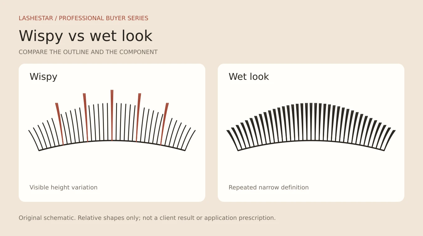
Wispy lash extensions and wet look lashes can share defined accents, but they describe different visual decisions. Wispy refers to an intentionally varied upper outline. Wet look refers to the separated, defined appearance associated with narrow or closed bundles. A salon can combine them, yet a buyer should not assume the same fan shape will satisfy both briefs.
For brands and salon groups, the most useful question is not which name is more fashionable. It is whether the range can reproduce the approved reference consistently, with the right base lengths, accent components and pack allocation. This guide compares the two effects and turns the differences into a practical sample and stocking plan.
Wispy, wet look and hybrid: three different labels
A wispy finish has deliberate variation at the tips. Some areas sit higher or appear more pointed than the surrounding base. A wet-look finish emphasizes defined bundles rather than a broadly spread, fluffy fan. Hybrid describes a mixture of classic and volume application, not a particular outline.
London Lash’s wispy hybrid guide separates the irregular top line from the classic/volume combination. That distinction is useful when a customer asks for “wispy hybrid lashes”: first agree the visible texture, then decide how the artist will build it. The service name does not establish a universal ratio.
| Question | Wispy brief | Wet-look brief |
|---|---|---|
| What should stand out? | Variation between base and accents | Narrow, separated definition |
| What must the sample show? | Readable tip contrast and balanced spacing | Consistent bundle silhouette and neat bases |
| What should the buyer record? | Base range, accent range and distribution | Fiber count, bundle width, length and construction |
| What can still vary? | Map, density, curl and application method | Map, outline contrast and degree of softness |
Read the reference before choosing the tray
Ask the customer to identify what she likes in the image. Is it the lightness, the tall points, the dark line near the roots or the outward shape? Those preferences lead to different decisions. Two photographs can both be described as wispy while one has a soft, broadly spread base and the other is dominated by narrow accents.
Compare images taken from the front with the eye open. An overhead view of a closed eye is useful for workmanship, but it does not show the same outline. For a supplier brief, annotate the reference with the intended base region and accent region. That makes feedback more precise than “make it more wispy.”
Keep reference permission separate from sample approval. A photograph can be used privately to explain a request without being licensed for a product catalogue. Obtain the necessary rights before publishing it, and do not label a diagram or generated illustration as a real client result.
Build the design in two records: base and accents
Use one record for the underlying silhouette and another for the visible accents. The base establishes the broad shape. Accents create contrast above or within that shape. If the team only writes down the longest size, another artist or supplier cannot reconstruct what made it look balanced.
An illustrative planning sketch might show a base that rises through the middle and tapers at the outside, with selected accent zones above it. The exact millimetres should come from the trained artist’s assessment. A drawing is useful for recording decisions; it cannot assess natural lash suitability from a label or a photograph.
Record the accent distribution as well as its length. A few prominent points and many fine points can have very different visual rhythms even when the longest fiber is identical. If the prototype looks too busy, review the number and spacing of accents before adding more length or density.
The Lash Map Generator can help record a base-and-spike concept using the lengths available to the artist. Use the saved map as a consultation and team communication aid. Confirm the final choice in person rather than treating a generated map as a service prescription.
What makes a spike read clearly?
A spike needs contrast with its surroundings. Contrast can come from its height, narrowness, direction or the amount of space around it. A longer component can disappear visually if the filler is equally prominent. Conversely, a restrained accent may read clearly when the surrounding texture is softer.
During sampling, photograph the design at the same distance and in the same lighting. Compare the accent silhouette before and after placement as part of a supervised professional evaluation. Record whether the component remains defined, opens unexpectedly or becomes difficult to distinguish from the base.
Do not solve an inconsistent component by accepting a vague promise that the artist can compensate. If a finished accent is part of a wholesale range, its shape should be sufficiently repeatable for the stated purpose. Agree which differences are acceptable and retain physical samples from the approved batch.
Choose components by function
| Component role | What to compare | Useful acceptance note |
|---|---|---|
| Soft base | Fan spread, tip finish, curl consistency | The base supports the outline without hiding the accents |
| Defined accent | Width, alignment, length and base construction | The point remains identifiable in the approved view |
| Transition sizes | Short lengths and adjacent curl profiles | The outline changes smoothly between zones |
| Hybrid single component | Profile and visual weight alongside fans | Definition matches the intended contrast |
Hand-fanned fibers and finished fans offer different workflows. A premade component may reduce the amount of fan preparation, while hand-fanning allows the trained artist to vary the construction during the service. Compare them in the actual workflow and avoid a fixed time-saving claim without your own measured trial.
See the premade fan guide for count, stem and pack checks. A finished open fan should not be described as a wet-look spike merely because both contain multiple fibers.
Curl combinations: optional, not a substitute for design
Different curls can change how accents project relative to the base. They can also make a simple design harder to reproduce across suppliers. Start the comparison with clearly identified curl samples and keep the intended result visible in the brief. If the curl letters match but the samples differ, approve the geometry rather than the letter alone.
For a first range, consider whether multiple curls solve an actual problem. A small, well-documented assortment can be easier for salons to use than a large palette with no clear roles. Add another curl when testers can explain the result it enables and the length combinations it requires.
Plan the assortment from consumption
A mixed tray can introduce the components and let a salon test several maps. Replenishment usually needs more detail. Count the sizes used in real services and record which components are consumed fastest. The decorative accent might be the most visible part of a style while accounting for a smaller share of stock use.
For example, a pilot salon could record base and accent usage separately for each service over a defined trial period. Convert the observations into a length-by-curl worksheet. Order quantities should follow that evidence, not an assumption that every row in a mixed tray empties at the same rate.
Ask whether row allocations can be changed without altering the physical product. A custom mixed tray should state the length on each row, the total rows and the order of the rows. If the pack contains finished fans, also confirm the usable count; row count alone does not tell the purchasing team how much service stock it contains.
A practical sample comparison
- Choose one reference for a soft wispy result and one for a more defined wet-look result.
- Write the intended differences in plain language before seeing supplier samples.
- Identify base, accent and transition components with unique sample codes.
- Have trained testers evaluate pickup and the intended professional use.
- Photograph approved results consistently, with permission where people are identifiable.
- Record consumption and handling feedback separately from appearance.
- Retain the approved components and the final pack specification.
Score each criterion separately. A sample that looks attractive in a tray may have awkward pickup, and a component that handles well may create a heavier outline than the brand intends. An overall score without written reasons makes it difficult to negotiate a useful revision.
Common brief failures and better corrections
“The set is not wispy enough”
State whether the issue is insufficient accent contrast, too much filler, or an overly uniform distribution. Send annotated comparisons from the same angle. This gives the supplier a component problem to investigate and the artist a design problem to review.
“The wet look is too fluffy”
Check whether the chosen components open more than expected and whether the approved sample actually represented the desired narrowness. A wider fan can be well made and still be wrong for the brief. Do not describe every mismatch as a quality defect.
“Every salon gets a different result”
Review whether the service instructions identify the same components, map and reference view. Differences in natural lashes still require individual adaptation, but an unclear range guide adds avoidable variation. Keep the product specification consistent and leave the clinical suitability decision to the professional.
Build the product page around the actual contents
For a branded wispy range, show what is in the pack: which rows are base lengths, which are accents, what curl and profile are supplied, and whether the components are individual fibers or finished fans. Include a close view of the construction. A dramatic finished-eye photograph alone cannot answer those purchasing questions.
Avoid naming the same unchanged tray as several different technical products. It can be suitable for several creative uses, but that is better explained through maps and examples. Clear component naming helps salons replenish without having to remember the campaign name used when they first ordered.
Questions buyers ask
Are wet look lashes actually wet?
The name describes the defined visual effect. It is not an instruction to leave lashes wet or to use extra adhesive. Professional handling and aftercare should follow the relevant product instructions and the salon’s established protocol.
Can wispy hybrid lashes use premade fans?
Finished fans can provide the volume component when their design suits the intended service. The hybrid label still refers to the combination of methods, while the wispy label refers to the result. Confirm both in the range guide.
Is there one correct accent length difference?
No universal difference should be copied onto every client. The perceived contrast depends on curl, natural direction, placement and surrounding texture as well as length. Use an illustrative drawing to discuss the relationship, then let the trained artist make the individual decision.
What should a brand launch first?
Launch the smallest assortment that can reliably reproduce the approved reference and be replenished clearly. Add variants after the pilot identifies a distinct need. Compare the softer Angel direction and more graphic anime direction before multiplying similar names.
Return to the lash extension styles and types guide for the full framework. To source components, explore Lashestar lash extensions and request samples against your written style brief.